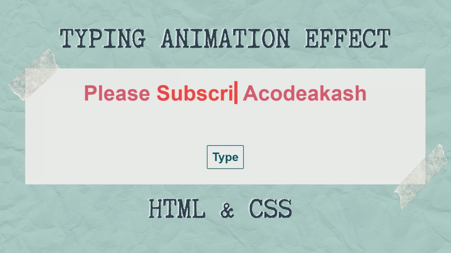
Learn to create CSS typing animation or typewriter effect. you can also called it text typing animation or text typewriter animation effect.
This is a small project for beginner who wants to practice small animation effect using HTML CSS. I have also added a ‘Type’ button on which JavaScript basic code is applied for restarting animation without refreshing page.
You can also loop this animation by changing small piece of code.
Type button and its JS are optional.
By learning this CSS animation you will realize the power of CSS.
HTML Code
Create H1 tag and write the text you want to display. Inside the text, please use span in which we are going to put our typing animation text.
const button = document.querySelector("button");
const word = document.querySelector("h1 span");

// reset the transition by...
button.addEventListener(
	"click",
	function (e) {
		e.preventDefault;

		// -> removing the class
		word.classList.remove("animation");

		// -> triggering reflow /* The actual magic */
		void word.offsetWidth;

		// -> and re-adding the class
		word.classList.add("animation");
	},
	false
);

 Get Twitter API in 2023 In today’s digital age, social media… Read more: How to Fetch Twitter Details | How to embed twitter to website using API | Twitter API v1.1
 10 Mind-Blowing Tricks to Elevate Your Web Design Skills As a… Read more: Boost Your Web Design Skills: 10 CSS Tricks That Will Blow Your Mind!
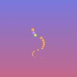 Adding animations to a web page is a fantastic way to… Read more: Creating Engaging Web Animations with HTML and CSS: A Simple Snake Animation Example
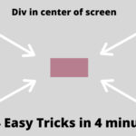 Are you looking to center a div on your webpage and… Read more: Center a div like a Pro: 4 Essential Techniques You Must Master in CSS
 Neumorphic design has taken the web design world by storm with… Read more: Neumorphic Design: Revolutionize Your Login Experience with Cutting-Edge Techniques