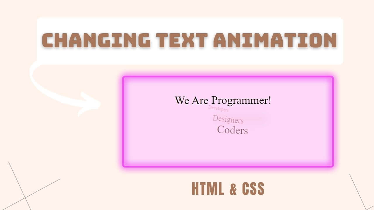
Hi, In this blog I am going to create a text animation using HTML & CSS. We can call it Text and background changing animation using CSS.
You will able to change text in rotating manner and also text shadow will be reflected at the text bottom which give it a realistic look.
Let’s the magic began!
HTML Code
Create a div and put your static code inside a ‘span’ tag.
Now, Take 2nd span tag and inside ‘p’ tag start writing your word which you want to add animations.
<div class="wrap">
	<span>We Are</span>
	<span class="text">
		<p>Developers</p>
		<p>Designers</p>
		<p>Coders</p>
		<p>Programmer!</p>
	</span>
</div>
CSS Code
Link your CSS file with HTML and start styling your Tags.
Now, You can achieve you animation by applying ‘Keyframes’ property of CSS.
Checkout Below Code.
.text {
	display: inline-block;
	width: 180px;
	text-align: left;
	height: 36px;
	vertical-align: -2px;
}
.text > p {
	font-size: 0px;
	opacity: 0;
	margin-left: -30px;
	position: absolute;
	box-shadow: 0px 60px 25px -20px rgba(0,0,0,0.5);
}
.text > p:nth-child(1) {
	animation: animation 5s linear infinite 0s;
}
.text > p:nth-child(2) {
	animation: animation 5s linear infinite 1s;
}
.text > p:nth-child(3) {
	animation: animation 5s linear infinite 2s;
}
.text > p:nth-child(4) {
	animation: animation 5s linear infinite 3s;
}

@keyframes animation {
	0% {
		font-size: 0px;
		opacity: 0;
		margin-left: -30px;
		margin-top: 0px;
		transform: rotate(-25deg);
	}
	3% {
		opacity: 1;
		transform: rotate(0deg);
	}
	5% {
		font-size: inherit;
		opacity: 1;
		margin-left: 0;
		margin-top: 0;
	}
	20% {
		font-size: inherit;
		opacity: 1;
		margin-left: 0;
		margin-top: 0;
		transform: rotate(0deg);
	}
	30% {
		font-size: inherit;
		opacity: 0.5;
		margin-left: 20px;
		margin-top: 100px;
	}
	100% {
		font-size: 0px;
		opacity: 0;
		margin-left: -30px;
		margin-top: 0px;
		transform: rotate(15deg);
	}
}
@keyframes bg {
	0%{background: #ff0075};
	3%{background: #0094ff};
	20%{background: #0094ff};
	23%{background: #b200ff};
	40%{background: #b200ff};
	60%{background: #8bc34A};
	64%{background: #8bc34A};
	80%{background: #f44336};
	83%{background: #f44336};
	100%{background: #f44336};
}
Watch Below Video for Detail Understanding

 Get Twitter API in 2023 In today’s digital age, social media… Read more: How to Fetch Twitter Details | How to embed twitter to website using API | Twitter API v1.1
 10 Mind-Blowing Tricks to Elevate Your Web Design Skills As a… Read more: Boost Your Web Design Skills: 10 CSS Tricks That Will Blow Your Mind!
 Adding animations to a web page is a fantastic way to… Read more: Creating Engaging Web Animations with HTML and CSS: A Simple Snake Animation Example
 Are you looking to center a div on your webpage and… Read more: Center a div like a Pro: 4 Essential Techniques You Must Master in CSS
 Neumorphic design has taken the web design world by storm with… Read more: Neumorphic Design: Revolutionize Your Login Experience with Cutting-Edge Techniques