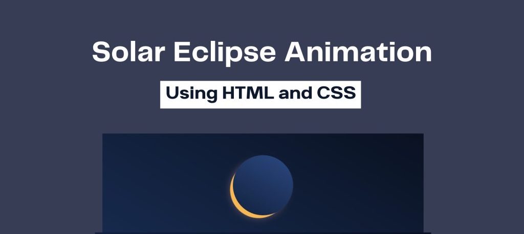
In this tutorial you will learn to create solar effect using CSS. You can also call it CSS animation for solar eclipse.
This is just a short tutorial and you will learn this animation just in 1 minute.
Enjoy!!
HTML Code
Below is HTML file Code.
<body>
	<div class="moon"></div>
</body>
CSS Code
Below is CSS file Code.
html, body {
	height: 100%;
	box-sizing: border-box;
}
body {
	display: flex;
	align-items: center;
	justify-content: center;
	overflow: hidden;
	background-image: linear-gradient(30deg, #182c51, #09101e);
}
.moon {
	background-image: linear-gradient(30deg, #13223f, #2b4980);
	width: 256px;
	height: 256px;
	border-radius: 50%;
	position: relative;
}
.moon::before {
	content: "";
	background-color: #ffa400;
	position: absolute;
	height: 100%;
	width: 100%;
	border-radius: 50%;
	z-index: -1;
	animation: 10.2s eclipse linear infinite alternate;
}
@keyframes eclipse {
	0% {
		transform: translate(-30px, 30px) scale(0.9);
	}
	50% {
		transform: translate(0px, 0px) scale(1.02);
		box-shadow: 0 0 10px #f9f3f2,
					0 0 80px 8px #c7938B;
		background: #efdbd8;
	}
	100% {
		transform: translate(30px, -30px) scale(0.9);
		box-shadow: none;
	}
} html, body {
	height: 100%;
	box-sizing: border-box;
}
body {
	display: flex;
	align-items: center;
	justify-content: center;
	overflow: hidden;
	background-image: linear-gradient(30deg, #182c51, #09101e);
}
.moon {
	background-image: linear-gradient(30deg, #13223f, #2b4980);
	width: 256px;
	height: 256px;
	border-radius: 50%;
	position: relative;
}
.moon::before {
	content: "";
	background-color: #ffa400;
	position: absolute;
	height: 100%;
	width: 100%;
	border-radius: 50%;
	z-index: -1;
	animation: 10.2s eclipse linear infinite alternate;
}
@keyframes eclipse {
	0% {
		transform: translate(-30px, 30px) scale(0.9);
	}
	50% {
		transform: translate(0px, 0px) scale(1.02);
		box-shadow: 0 0 10px #f9f3f2,
					0 0 80px 8px #c7938B;
		background: #efdbd8;
	}
	100% {
		transform: translate(30px, -30px) scale(0.9);
		box-shadow: none;
	}
}
Watch Below Video for Detail Understanding

 Get Twitter API in 2023 In today’s digital age, social media… Read more: How to Fetch Twitter Details | How to embed twitter to website using API | Twitter API v1.1
 10 Mind-Blowing Tricks to Elevate Your Web Design Skills As a… Read more: Boost Your Web Design Skills: 10 CSS Tricks That Will Blow Your Mind!
 Adding animations to a web page is a fantastic way to… Read more: Creating Engaging Web Animations with HTML and CSS: A Simple Snake Animation Example
 Are you looking to center a div on your webpage and… Read more: Center a div like a Pro: 4 Essential Techniques You Must Master in CSS
 Neumorphic design has taken the web design world by storm with… Read more: Neumorphic Design: Revolutionize Your Login Experience with Cutting-Edge Techniques