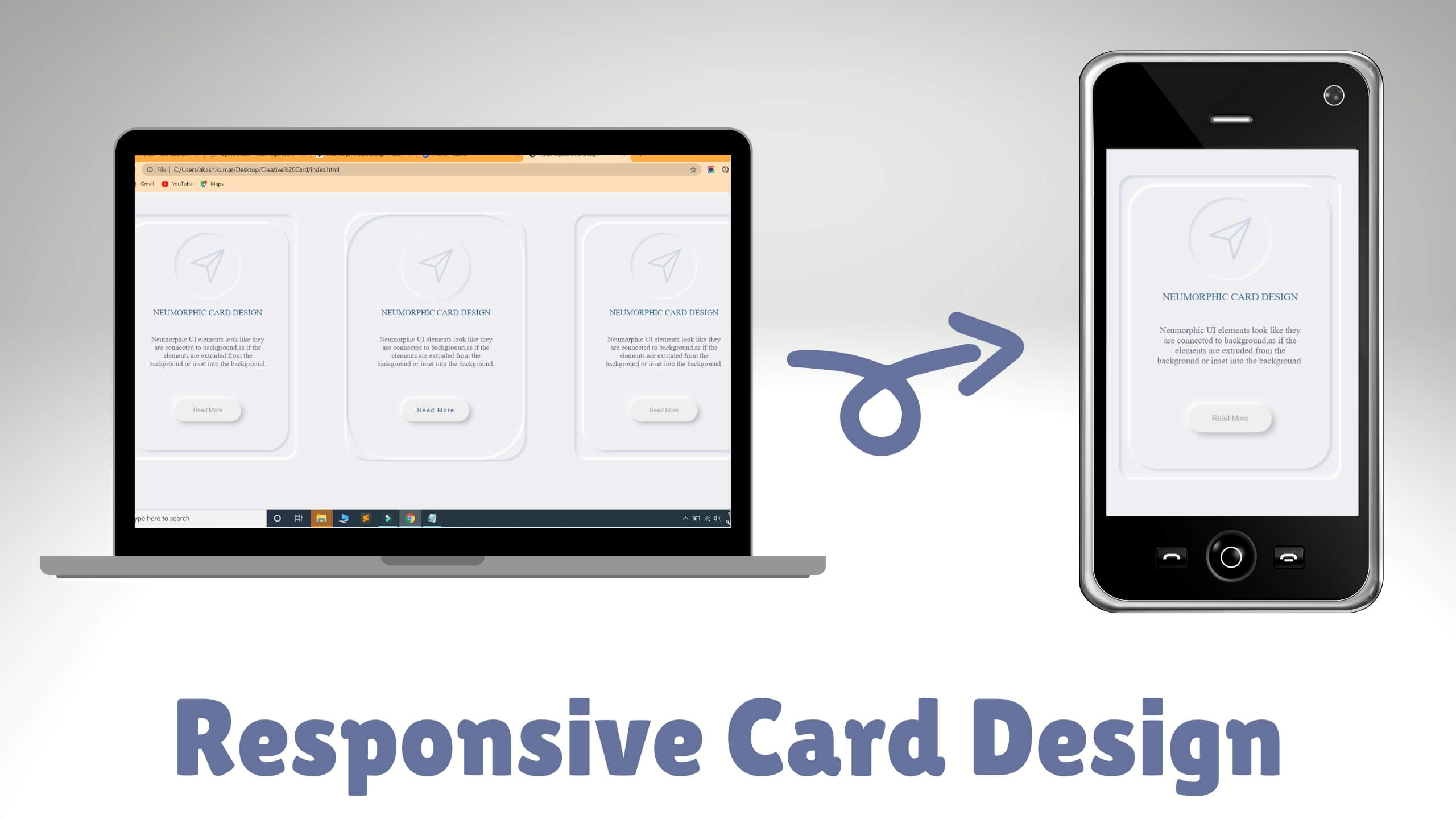
Create a wrapper class and add your cards inside it.
I have use Flexbox for creating responsive card design.
Below is HTML file Code.
<body>
	<div class="wrapper">
		<div class="card-container">
			<div class="card-box">
				<div class="icon">
					<svg class="svg-icon" viewBox="0 0 20 20">
							<path d="M17.218,2.268L2.477,8.388C2.13,8.535,2.164,9.05,2.542,9.134L9.33,10.67l1.535,6.787c0.083,0.377,0.602,0.415,0.745,0.065l6.123-14.74C17.866,2.46,17.539,2.134,17.218,2.268 M3.92,8.641l11.772-4.89L9.535,9.909L3.92,8.641z M11.358,16.078l-1.268-5.613l6.157-6.157L11.358,16.078z"></path>
						</svg>
				</div>
				<div class="heading">
					Neumorphic Card Design
				</div>
				<p class="detail">
					Neumorphic UI elements look like they are connected to background,as if the elements are extruded from the background or inset into the background.
				</p>
				<button type="button" class="btn">Read More</button>
			</div>
		</div>
		<!--  -->
		<div class="card-container">
			<div class="card-box">
				<div class="icon">
					<svg class="svg-icon" viewBox="0 0 20 20">
							<path d="M17.218,2.268L2.477,8.388C2.13,8.535,2.164,9.05,2.542,9.134L9.33,10.67l1.535,6.787c0.083,0.377,0.602,0.415,0.745,0.065l6.123-14.74C17.866,2.46,17.539,2.134,17.218,2.268 M3.92,8.641l11.772-4.89L9.535,9.909L3.92,8.641z M11.358,16.078l-1.268-5.613l6.157-6.157L11.358,16.078z"></path>
						</svg>
				</div>
				<div class="heading">
					Neumorphic Card Design
				</div>
				<p class="detail">
					Neumorphic UI elements look like they are connected to background,as if the elements are extruded from the background or inset into the background.
				</p>
				<button type="button" class="btn">Read More</button>
			</div>
		</div>
	</div>
</body>

 Get Twitter API in 2023 In today’s digital age, social media… Read more: How to Fetch Twitter Details | How to embed twitter to website using API | Twitter API v1.1
 10 Mind-Blowing Tricks to Elevate Your Web Design Skills As a… Read more: Boost Your Web Design Skills: 10 CSS Tricks That Will Blow Your Mind!
 Adding animations to a web page is a fantastic way to… Read more: Creating Engaging Web Animations with HTML and CSS: A Simple Snake Animation Example
 Are you looking to center a div on your webpage and… Read more: Center a div like a Pro: 4 Essential Techniques You Must Master in CSS
 Neumorphic design has taken the web design world by storm with… Read more: Neumorphic Design: Revolutionize Your Login Experience with Cutting-Edge Techniques