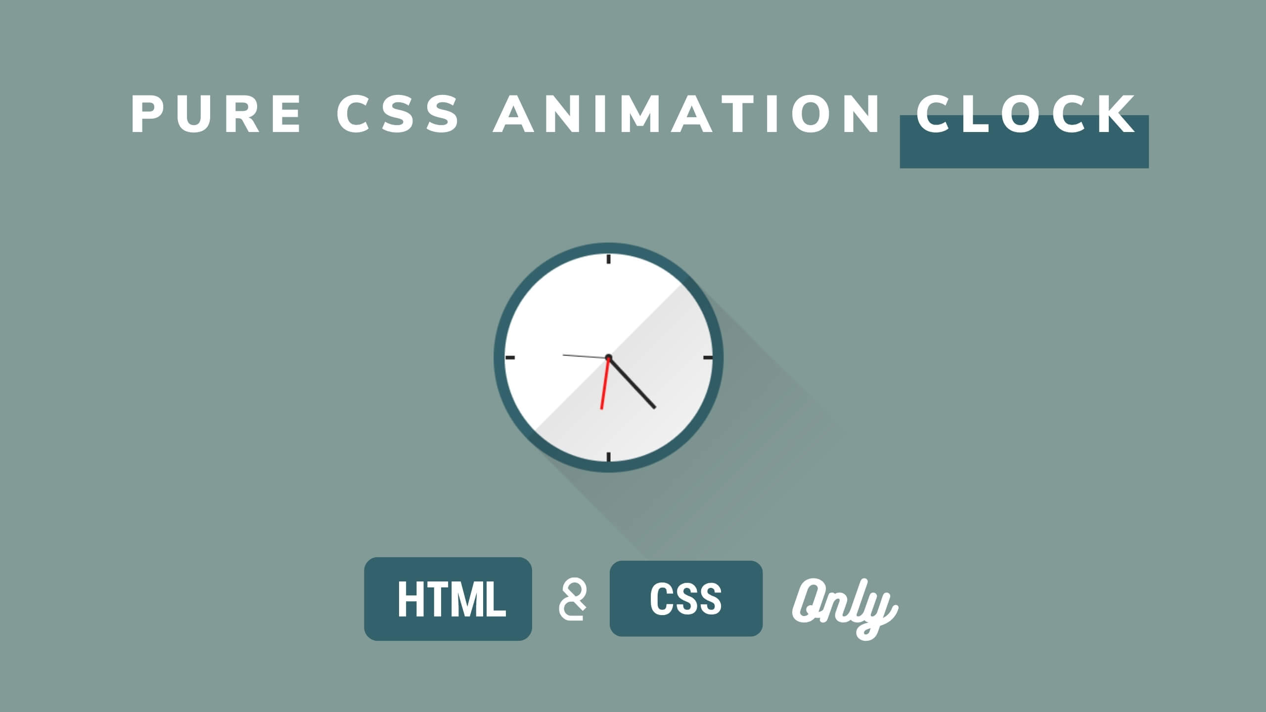
CSS Animated Clock – Pure CSS Clock Shape – CSS Animation Effect
Clock UI Design with Animation
Clock Design Using HTML and CSS
Rotating Clock CSS3 Animation | HTML CSS
Animated Wall Clock design using HTML CSS
HTML Code
Create a clock class div and create div for every element which we are going to use.
Below is HTML file Code.
<div class="clock">
	<div class="top"></div>
	<div class="right"></div>
	<div class="bottom"></div>
	<div class="left"></div>
	<div class="center"></div>
	<div class="shadow"></div>
	<div class="hour"></div>
	<div class="minute"></div>
	<div class="second"></div>
</div>
CSS Code Use absolute CSS property to align clock middle of screen.
Create Hour, Minute and Second clock handles.
Below is CSS file Code.
.clock {
	position: absolute;
	height: 200px;
	width: 200px;
	background-color: #fff;
	border-radius: 100%;
	border: 10px solid #34626c;
	top: 0;
	left: 0;
	right: 0;
	bottom: 0;
	margin: auto;
}
.clock .top {
	position: absolute;
	width: 3px;
	height: 8px;
	background-color: #262626;
	left: 0;
	right: 0;
	margin: 0 auto;
}
.clock .right {
	position: absolute;
	width: 8px;
	height: 3px;
	background-color: #262626;
	top: 0;
	bottom: 0;
	right: 0;
	margin: auto;
}
.clock .bottom {
	position: absolute;
	width: 3px;
	height: 8px;
	background-color: #262626;
	left: 0;
	right: 0;
	bottom: 0;
	margin: 0 auto;
}
.clock .left {
	position: absolute;
	width: 8px;
	height: 3px;
	background-color: #262626;
	top: 0;
	left: 0;
	bottom: 0;
	margin: auto;
}
.clock .center {
	height: 6px;
	width: 6px;
	background-color: #262626;
	border-radius: 100%;
	position: absolute;
	left: 0;
	right: 0;
	top: 0;
	bottom: 0;
	margin: auto;
}
.clock .shadow {
	background:linear-gradient(rgba(0, 0, 0, 0),
								rgba(0, 0, 0, 0.1));
	height: 200px;
	width: 200px;
	position: absolute;
	left: 60px;
	top: 60px;
	transform: rotate(135deg);
}
.clock .hour {
	width: 3px;
	height: 100%;
	position: absolute;
	left: 0;
	right: 0;
	margin: 0 auto;
	animation: time 3600s infinite linear;
}
.clock .hour:before {
	content: "";
	height: 60px;
	width: 3px;
	background-color: #262626;
	position: absolute;
	top: 30px;
}

.clock .minute {
	width: 1px;
	height: 100%;
	position: absolute;
	left: 0;
	right: 0;
	margin: 0 auto;
	animation: time 360s infinite linear;
}
.clock .minute:before {
	position: absolute;
	content: "";
	background-color: #262626;
	height: 40px;
	width: 1px;
	top: 50px;
}
.clock .second {
	width: 2px;
	height: 100%;
	position: absolute;
	left: 0;
	right: 0;
	margin: 0 auto;
	animation: time 15s infinite linear;
}
.clock .second:before {
	position: absolute;
	content: "";
	background-color: #fd1111;
	height: 45px;
	width: 2px;
	top: 45px;
}

@keyframes time {
	to {
		transform: rotate(360deg);
	}
}
NOTE : You can use animation time as 86400s for hours, 3600s for minutes and 60s for second to create a real time clock.
Assign these numbers in .second, .minute, .hour classes in from of the “animation” property as following: .second{animation: time 86400s infinite linear;} .minute{animation: time 3600s infinite linear;} .hour{animation: time 60s infinite linear;}
Watch Below Video for Detail Understanding
VIDEO

 Get Twitter API in 2023 In today’s digital age, social media… Read more: How to Fetch Twitter Details | How to embed twitter to website using API | Twitter API v1.1
 10 Mind-Blowing Tricks to Elevate Your Web Design Skills As a… Read more: Boost Your Web Design Skills: 10 CSS Tricks That Will Blow Your Mind!
 Adding animations to a web page is a fantastic way to… Read more: Creating Engaging Web Animations with HTML and CSS: A Simple Snake Animation Example
 Are you looking to center a div on your webpage and… Read more: Center a div like a Pro: 4 Essential Techniques You Must Master in CSS
 Neumorphic design has taken the web design world by storm with… Read more: Neumorphic Design: Revolutionize Your Login Experience with Cutting-Edge Techniques