Discover the Power of Neumorphic Card Design for Your UI
If you’re looking for a design that will truly make your website stand out, you may want to consider implementing neumorphic cards. This elegant UI solution creates a unique 3D effect that makes it look like the elements are either extruded from or inset into the background.
At first glance, neumorphic UI elements might seem complex to implement. However, they can be achieved using simple HTML and CSS code. Here’s an example code snippet for a neumorphic card:
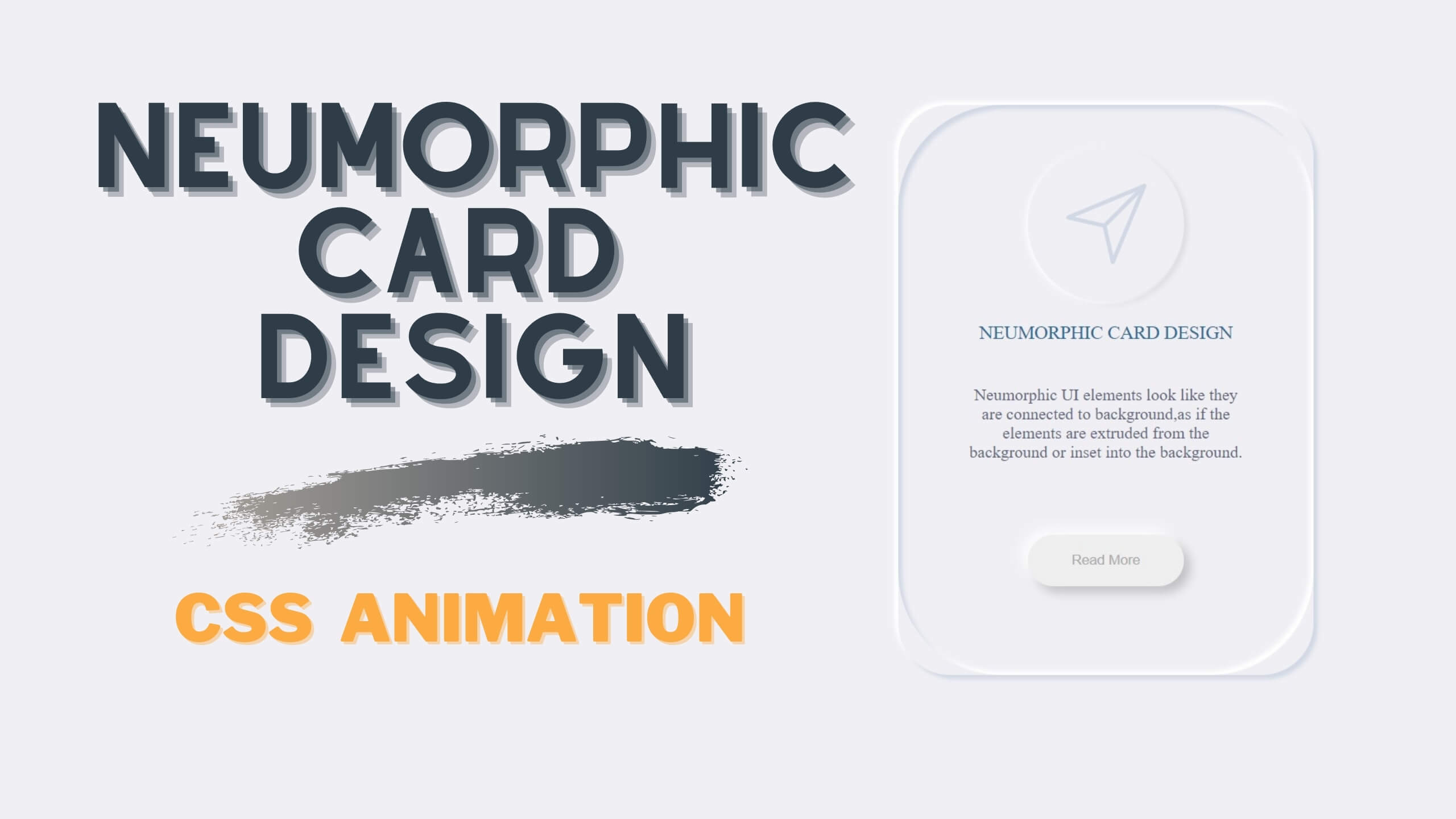
Add a icon, title, description and Read more Button inside card container.
Below is HTML file Code.
<div class="card-container">
	<div class="card-box">
		<div class="icon">
			<svg class="svg-icon" viewBox="0 0 20 20">
					<path d="M17.218,2.268L2.477,8.388C2.13,8.535,2.164,9.05,2.542,9.134L9.33,10.67l1.535,6.787c0.083,0.377,0.602,0.415,0.745,0.065l6.123-14.74C17.866,2.46,17.539,2.134,17.218,2.268 M3.92,8.641l11.772-4.89L9.535,9.909L3.92,8.641z M11.358,16.078l-1.268-5.613l6.157-6.157L11.358,16.078z"></path>
				</svg>
		</div>
		<div class="heading">
			Neumorphic Card Design
		</div>
		<p class="detail">
			Neumorphic UI elements look like they are connected to background,as if the elements are extruded from the background or inset into the background.
		</p>
		<button type="button" class="btn">Read More</button>
	</div>
</div>
CSS Code
Below is CSS file Code.
.card-container {
	box-shadow: 4px 4px 4px 0 #d1d9e6 inset,
				-4px -4px 4px 0 #fff inset;
	height: 550px;
	width: 400px;
	border-radius: 25px;
	margin: 50px auto;
	padding: 20px;
	transition: all 0.4s ease-in-out;
}
.card-container:hover {
	padding: 0;
	border-radius: 100px;
	transition: all 0.4s ease-in-out;
}
.card-box {
	height: 100%;
	box-shadow: 4px 4px 4px 0 #d1d9e6,
				-4px -4px 4px 0 #fff;
	padding: 20px;
	border-radius: 50px;
	transition: all 0.4s ease-in-out;
}
.card-container:hover .card-box {
	padding: 40px;
}
.icon svg {
	height: 100px;
	width: 100px;
	fill: #d1d9e6;
	margin: 0 auto;
	display: block;
}
.icon {
	box-shadow: inset -2px -2px 5px #fff,
				inset 3px 3px 5px rgba(0, 0, 0, 0.1);
	border-radius: 50%;
	height: 150px;
	width: 150px;
	padding: 25px;
	margin: 0 auto;
	transition: box-shadow 0.4s ease-in-out;
}
.card-container:hover .icon {
	box-shadow: -2px 2px 5px #fff,
				3px 3px 5px rgba(0,0,0,0.1);
	transition: box-shadow 0.4s ease-in-out;
}
.heading {
	text-align: center;
	text-transform: uppercase;
	font-size: 18px;
	padding: 20px 25px;
	color: #296894;
}
.detail {
	text-align: center;
	font-size: 16px;
	color: #635f82;
	padding: 20px 25px;
}
.btn {
	margin: 0 auto;
	display: block;
	width: 150px;
	height: 50px;
	border:none;
	box-shadow: -6px -6px 10px rgba(255, 255, 255, 0.8),
				6px 6px 10px rgba(0, 0, 0, 0.2);
	margin-top: 50px;
	border-radius: 50px;
	cursor: pointer;
	color: #aaa;
	transition: all 0.4s ease-in-out;
}
.btn:hover {
	color: #296894;
	letter-spacing: 2px;
	transition: all 0.4s ease-in-out;
}
.btn:active,
.btn:focus {
	outline: 0;
	border: none;
}
Introduction to Neumorphic Card Design
If you’re looking for a fresh, innovative approach to user interface (UI) design, you might want to consider neumorphic card design. This hot new trend takes inspiration from the physical world to create visually stunning and user-friendly interfaces.
Neumorphic UI elements look like they are connected to the background, as if they are extruded from the background or inset into it. This creates a sense of depth and texture that can make your UI stand out from the crowd.
Creating a Neumorphic Card Design with CSS
To create a neumorphic card design, you’ll need to use a combination of light and shadow to create the illusion of depth. This is where the CSS code comes in. With box-shadow, padding, and border-radius properties, you can create the desired effect and customize it to your liking.
The Benefits of Neumorphic Card Design for UI
The result is a card design that looks like it’s hovering over the background, with a tactile quality that makes it feel like a physical object. It’s perfect for creating buttons, menus, and other interactive elements that users will love.
But neumorphic card design isn’t just about aesthetics. It also has practical benefits for UI design. By using light and shadow to create depth, you can guide the user’s eye to important elements on the page. This can make your UI more intuitive and user-friendly.
Give Neumorphic Card Design a Try
So if you’re looking for a new way to approach UI design, give neumorphic card design a try. With its innovative blend of form and function, it’s sure to make your UI stand out from the rest.
If you found this article on neumorphic card design informative and interesting, be sure to check out my other blogs on the topic. I cover various aspects of neumorphic design, including tips and tricks for creating stunning neumorphic UI elements, as well as examples of neumorphic designs in action. So, if you want to learn more about this hot design trend and how to incorporate it into your own projects, be sure to explore my other neumorphic design articles.
Neumorphic Switch Button
Try https://neumorphism.io/ for generation neumphic design

 Get Twitter API in 2023 In today’s digital age, social media… Read more: How to Fetch Twitter Details | How to embed twitter to website using API | Twitter API v1.1
 10 Mind-Blowing Tricks to Elevate Your Web Design Skills As a… Read more: Boost Your Web Design Skills: 10 CSS Tricks That Will Blow Your Mind!
 Adding animations to a web page is a fantastic way to… Read more: Creating Engaging Web Animations with HTML and CSS: A Simple Snake Animation Example
 Are you looking to center a div on your webpage and… Read more: Center a div like a Pro: 4 Essential Techniques You Must Master in CSS
 Neumorphic design has taken the web design world by storm with… Read more: Neumorphic Design: Revolutionize Your Login Experience with Cutting-Edge Techniques