
Glassmorphism
Recently I was checking a few designs on Dribbble and got this new UI trend that has caught tons of attention. So, I have decided to share this amazing UI design called Glassmorphism.
This UI element is meant to resemble the feature of smooth glass. The essential idea is to blur the background of the element to offer a transparent glassy look.
Glassmorphism is going to be trending Design in 2021 because it is gaining more popularity on services like Dribbble and Behance.
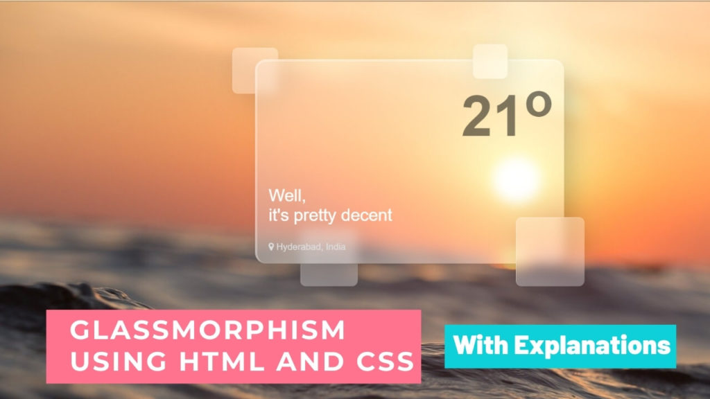
In this tutorial i will create a simple Weather Application using HTML and CSS.
Features of Glassmorphism
Below are the points that should be kept in mind while designing a neat glass look.
- Transparency: Set a light transparent background.
- Blur background: To give a frosted glass feel – increasing the blur effect, giving it more depth by using box-shadow.
- Border: For creating glass edge detail add a small border to your element.
It is created in a multi-layered approach which looks like the objects are floating in space which also give 3D feel to our element.
Great, You are ready now.
Use HTML and CSS to build a basic implementation of this new UI trend i.e glassmorphism.
Create a div in HTML and add the skeleton of your design/element.
Next comes CSS, You have to understand and use below CSS properties.
Here is the HTML for the glass element :
<body>
  <div class="container">
    <div class="glassmorphism">
        <div class="weather-box">
            <h1>21<sup>o</sup></h1>
            <p>Well,<br>it's pretty decent</p>
            <div class="location">
              <i class="fa fa-map-marker" aria-hidden="true"></i>
              <span>Hyderabad, India</span>
            </div>
        </div>
        <div class="drops">
          <div class="drop drop-1"></div>
          <div class="drop drop-2"></div>
          <div class="drop drop-3"></div>
          <div class="drop drop-4"></div>
        </div>
    </div>
  </div>
</body>
Here is the CSS for the glass element :
body {
  background-image: url(waves.jpg);
  background-repeat: no-repeat;
  background-size: cover;
  margin: 0;
}
.container {
  display: grid;
  place-items: center;
  height: 100vh;
}
.glassmorphism {
  width: 520px;
  height: 520px;
  position: relative;
}
.weather-box {
  background: rgba(255,255,255,0.3);
  padding: 20px;
  width: 500px;
  border-radius: 20px;
  border-left: 4px solid rgba(255, 255, 255, 0.3);
  border-top: 4px solid rgba(255, 255, 255, 0.3);
  -webkit-backdrop-filter: blur(4px);
          backdrop-filter: blur(10px);
  box-shadow: 20px 20px 40px -6px rgba(0, 0, 0, 0.2);
  font-family: 'Roboto', sans-serif;
}
.weather-box h1 {
  font-size: 100px;
  text-align: right;
  margin-top: 0;
  color: transparent;
  text-shadow: 1px 1px rgba(0,0,0,0.5);
}
.weather-box p {
  font-size: 30px;
  color: #fff;
}
.location {
  color: #ddd;
}
.drop {
  background: rgba(255, 255, 255, 0.3);
  -webkit-backdrop-filter: blur(10px);
          backdrop-filter: blur(10px);
  border-radius: 10px;
  border-left: 1px solid rgba(255, 255, 255, 0.3);
  border-top: 1px solid rgba(255, 255, 255, 0.3);
  box-shadow: 10px 10px 60px -8px rgba(0, 0, 0, 0.2);
  position: absolute;
  -webkit-transition: all 0.2s ease;
  transition: all 0.2s ease;
}
.drop-1 {
  height: 80px;
  width: 80px;
  top: -20px;
  left: -40px;
  z-index: -1;
}
.drop-2 {
  height: 100px;
  width: 100px;
  bottom: 120px;
  left: 80px;
  z-index: -1;
}
.drop-3 {
  height: 120px;
  width: 120px;
  bottom: 120px;
  right: -60px;
}
.drop-4 {
  height: 60px;
  width: 60px;
  top: -26px;
  right: 75px;
}
Few Practical uses of glassmorphism are cards, notification bars, or any block that holds the integral elements of the UI.
It is also used in one of the mainstream applications design appeared in Apple’s macOS Big Sur which rolled out in 2020.
Alright this is done but wait lets see a few bonus points on Glassmorphism.
History Of Glasssmorphism
This type of Design was first introduced in 2013 with iOS 7. Also window vista there were few glimpse of this design were introduced in window vista.
In iOS 7 when users scroll down there notification bar, the icons start fading and this makes people attracted to this UI design.
My person Thought on glassmorphism
For me this design is modern and it’s really attractive. Gradients and bright colors are very popular among designers and this is going to be a trending design in 2021.
Thank you!
Also please checkout my Youtube channel for videos related to Glassmorphism design and other tutorials on UI development.
Follow me on Instagram.
Comment down below if you have any feedback or suggestions.
- How to Fetch Twitter Details | How to embed twitter to website using API | Twitter API v1.1
 Get Twitter API in 2023 In today’s digital age, social media… Read more: How to Fetch Twitter Details | How to embed twitter to website using API | Twitter API v1.1
 - Boost Your Web Design Skills: 10 CSS Tricks That Will Blow Your Mind!
 10 Mind-Blowing Tricks to Elevate Your Web Design Skills As a… Read more: Boost Your Web Design Skills: 10 CSS Tricks That Will Blow Your Mind!
 - Creating Engaging Web Animations with HTML and CSS: A Simple Snake Animation Example
 Adding animations to a web page is a fantastic way to… Read more: Creating Engaging Web Animations with HTML and CSS: A Simple Snake Animation Example
 - Center a div like a Pro: 4 Essential Techniques You Must Master in CSS
 Are you looking to center a div on your webpage and… Read more: Center a div like a Pro: 4 Essential Techniques You Must Master in CSS
 - Neumorphic Design: Revolutionize Your Login Experience with Cutting-Edge Techniques
 Neumorphic design has taken the web design world by storm with… Read more: Neumorphic Design: Revolutionize Your Login Experience with Cutting-Edge Techniques