Adding animations to a web page is a fantastic way to make it more visually appealing and engaging for users. In this code, we demonstrate a simple yet captivating animation created using HTML and CSS, which can elevate your design game.
The HTML code comprises twenty div elements with a class called “snake” and a number between one and twenty-one. These divs are the foundation of the snake animation.
<div class="snake snake1"></div>
<div class="snake snake2"></div>
<div class="snake snake3"></div>
<div class="snake snake4"></div>
<div class="snake snake5"></div>
<div class="snake snake6"></div>
<div class="snake snake7"></div>
<div class="snake snake8"></div>
<div class="snake snake9"></div>
<div class="snake snake10"></div>
<div class="snake snake11"></div>
<div class="snake snake12"></div>
<div class="snake snake13"></div>
<div class="snake snake14"></div>
<div class="snake snake15"></div>
<div class="snake snake16"></div>
<div class="snake snake17"></div>
<div class="snake snake18"></div>
<div class="snake snake19"></div>
<div class="snake snake20"></div>
<div class="snake snake21"></div>
Let’s delve into the CSS code. The “.snake” class defines the styling for all twenty divs. We used the border-radius property to create a circular shape for each div, while the background-image property applies a linear gradient from bright orange to soft yellow.
.snake {
  border-radius: 50%;
  background-image: linear-gradient(to bottom right, #ff8000, #ffd500);
  -webkit-animation: snake 1.3s cubic-bezier(0.78,0.15,0.13,0.86) infinite;
 transform: translate3d(-40px, 0, 0);
}

@-webkit-keyframes snake {
  50% {
    transform: translate3d(40px, 0, 0);
  }
}

@keyframes snake {
  50% {
    transform: translate3d(40px, 0, 0);
  }
}
.snake:nth-child(1) {
  -webkit-animation-delay: 0.1s;
          animation-delay: 0.1s;
  width: 20px;
  height: 20px;
}

.snake:nth-child(2) {
  -webkit-animation-delay: 0.2s;
          animation-delay: 0.2s;
  width: 19px;
  height: 19px;
}

.snake:nth-child(3) {
  -webkit-animation-delay: 0.3s;
          animation-delay: 0.3s;
  width: 18px;
  height: 18px;
}

.snake:nth-child(4) {
  -webkit-animation-delay: 0.4s;
          animation-delay: 0.4s;
  width: 17px;
  height: 17px;
}

.snake:nth-child(5) {
  -webkit-animation-delay: 0.5s;
          animation-delay: 0.5s;
  width: 16px;
  height: 16px;
}

.snake:nth-child(6) {
  -webkit-animation-delay: 0.6s;
          animation-delay: 0.6s;
  width: 15px;
  height: 15px;
}

.snake:nth-child(7) {
  -webkit-animation-delay: 0.7s;
          animation-delay: 0.7s;
  width: 14px;
  height: 14px;
}

.snake:nth-child(8) {
  -webkit-animation-delay: 0.8s;
          animation-delay: 0.8s;
  width: 13px;
  height: 13px;
}

.snake:nth-child(9) {
  -webkit-animation-delay: 0.9s;
          animation-delay: 0.9s;
  width: 12px;
  height: 12px;
}

.snake:nth-child(10) {
  -webkit-animation-delay: 1s;
          animation-delay: 1s;
  width: 11px;
  height: 11px;
}

.snake:nth-child(11) {
  -webkit-animation-delay: 1.1s;
          animation-delay: 1.1s;
  width: 10px;
  height: 10px;
}

.snake:nth-child(12) {
  -webkit-animation-delay: 1.2s;
          animation-delay: 1.2s;
  width: 9px;
  height: 9px;
}

.snake:nth-child(13) {
  -webkit-animation-delay: 1.3s;
          animation-delay: 1.3s;
  width: 8px;
  height: 8px;
}

.snake:nth-child(14) {
  -webkit-animation-delay: 1.4s;
          animation-delay: 1.4s;
  width: 7px;
  height: 7px;
}

.snake:nth-child(15) {
  -webkit-animation-delay: 1.5s;
          animation-delay: 1.5s;
  width: 6px;
  height: 6px;
}

.snake:nth-child(16) {
  -webkit-animation-delay: 1.6s;
          animation-delay: 1.6s;
  width: 5px;
  height: 5px;
}

.snake:nth-child(17) {
  -webkit-animation-delay: 1.7s;
          animation-delay: 1.7s;
  width: 4px;
  height: 4px;
}

.snake:nth-child(18) {
  -webkit-animation-delay: 1.8s;
          animation-delay: 1.8s;
  width: 3px;
  height: 3px;
}

.snake:nth-child(19) {
  -webkit-animation-delay: 1.9s;
          animation-delay: 1.9s;
  width: 2px;
  height: 2px;
}

.snake:nth-child(20) {
  -webkit-animation-delay: 2s;
          animation-delay: 2s;
  width: 1px;
  height: 1px;
}

.snake1 {
  background-image: linear-gradient(to bottom right, #ff8000, #ffd500);
}

.snake2 {
  background-image: linear-gradient(to bottom right, #ff00ff, #00ffff);
}

.snake3 {
  background-image: linear-gradient(to bottom right, #ffff00, #00ff00);
}

/* and so on */
In addition, we used keyframes in the “@-webkit-keyframes” and “@keyframes” rules to define the snake animation’s movement. Each div moves to the right by 40 pixels and then back to the left, creating a slithering snake illusion.
We also utilized the “.snake:nth-child” selectors to style each div with a unique width and height. Furthermore, the selectors create a delay that gradually increases by 0.1 seconds for each div, producing a staggered effect.
This code highlights HTML and CSS’s creative potential for adding dynamic and interactive elements to a web page. Experimenting with various properties, selectors, and keyframes can result in a wide range of animations and effects that can enhance the user experience and make your website stand out.
In conclusion, this code offers an excellent example of using CSS animations to create a fun and interactive design. With a little imagination and creativity, you can design captivating animations that will make your website more engaging and memorable for users.


 Get Twitter API in 2023 In today’s digital age, social media… Read more: How to Fetch Twitter Details | How to embed twitter to website using API | Twitter API v1.1
 10 Mind-Blowing Tricks to Elevate Your Web Design Skills As a… Read more: Boost Your Web Design Skills: 10 CSS Tricks That Will Blow Your Mind!
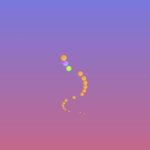 Adding animations to a web page is a fantastic way to… Read more: Creating Engaging Web Animations with HTML and CSS: A Simple Snake Animation Example
 Are you looking to center a div on your webpage and… Read more: Center a div like a Pro: 4 Essential Techniques You Must Master in CSS
 Neumorphic design has taken the web design world by storm with… Read more: Neumorphic Design: Revolutionize Your Login Experience with Cutting-Edge Techniques